Graphics · Creative Retail Awards 2026
40th Birthday Summer Tour, with Northbanks
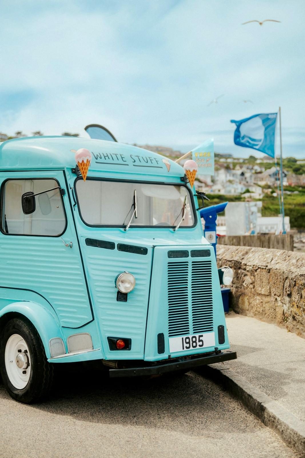
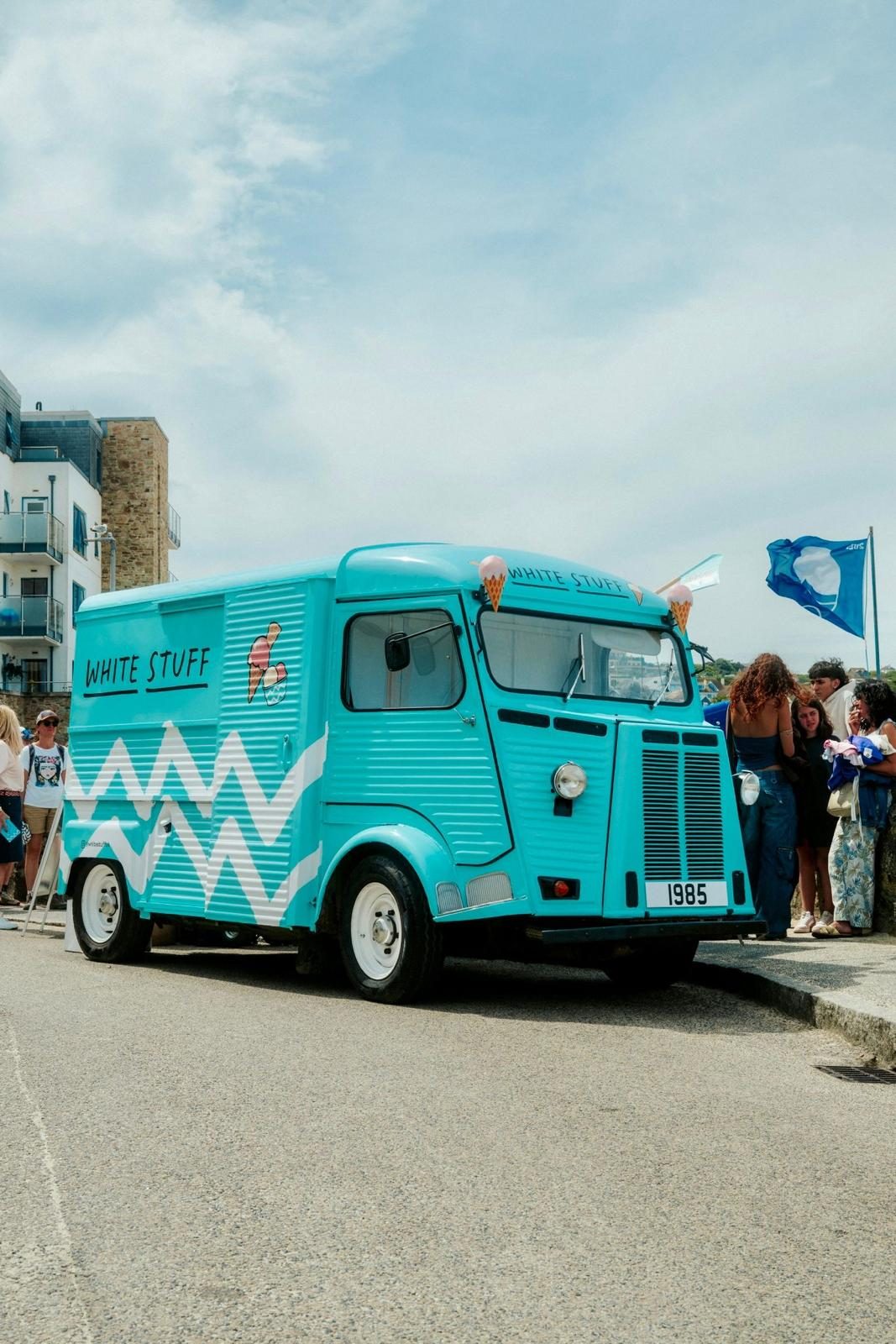
White Stuff's 40th Birthday Summer Tour turned a restored vintage ice cream van into a travelling brand space, using hand-drawn graphics and the brand's turquoise palette across every touchpoint.
The project
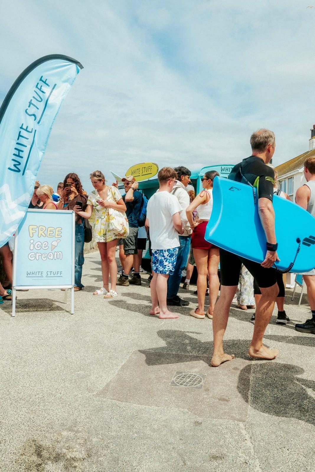
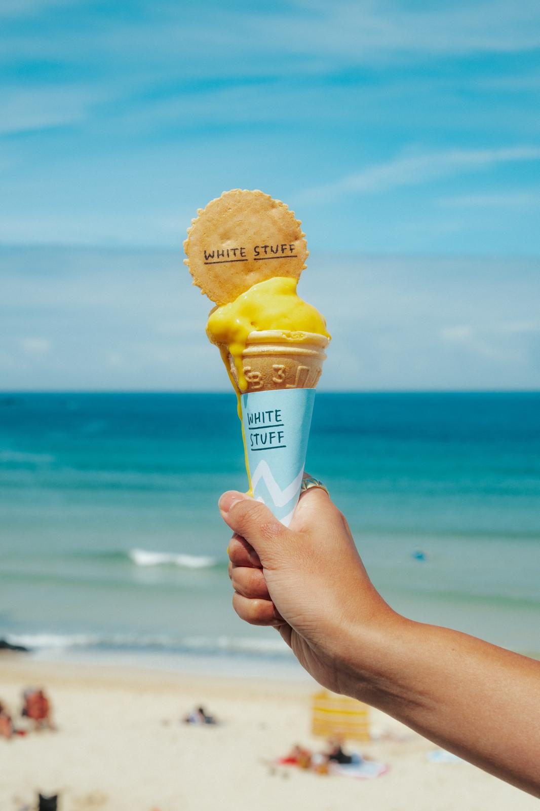
White Stuff built its Summer Tour around nostalgia and British seaside culture, turning a sampling campaign into a brand experience centred on a restored vintage ice cream van parked in busy coastal locations. Visitors were offered free artisan ice cream and branded merchandise, and the set-up was designed to be photographed and shared online, carrying the campaign beyond each stop.
The van wore the brand's signature turquoise across its bodywork, with oversized ice cream cone details and playful illustrated touches. The graphic language deliberately stepped away from polished corporate branding in favour of hand-drawn illustration, relaxed typography, surf-inspired zig-zags and ice cream motifs, while softer pastel tones kept the overall feel light and nostalgic.
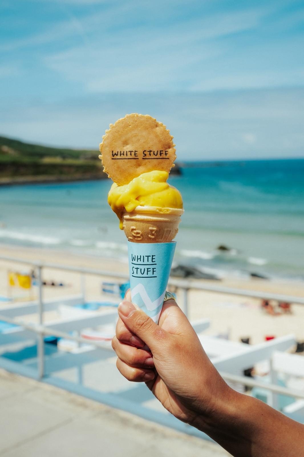
The same identity ran across the van, signage, flags, packaging and branded wafers, reaching details such as custom dog bowls. Inside, the vehicle was adapted for high-volume service, so the tour kept its character during busy periods and stayed visually consistent at every location.
“Winning Graphics for White Stuff’s 40th Birthday Summer Tour means a lot to us. So much care goes into bringing these projects to life, and it’s lovely to see the team’s hard work recognised. A brilliant night at The Clapham Grand, celebrating with the team and so many people from across the industry.”


The category
The Graphics category recognises printed and digital graphic design in retail environments, from signs to wider graphic schemes. It rewards work in which clear communication and a strong expression of brand values combine to improve how customers understand a space and how they perceive the brand.
Read the full criteria →How it meets the criteria
Hand-drawn illustration, casual typography and the signature turquoise palette express a playful, relaxed White Stuff personality in place of polished corporate branding.
One graphic identity runs across the van, signage, flags, packaging and branded wafers, with pastel tones softening the bright turquoise wrap.
Treating a restored ice cream van as both retail space and marketing tool, the graphics turned a sampling campaign into a mobile pop-up that travelled to customers.
2026 winners
We have received your subscription request.